Landscape Composition: Foreground, Layers, and Leading Lines That Actually Work
Why the rule of thirds alone leaves landscape photos flat, and how foreground, layering, and leading lines actually build depth, with a worked example from the Dolomites.
Landscape Composition: Foreground, Layers, and Leading Lines That Actually Work
I used to teach composition the way almost every photography blog still does: grab a photo, drop a nine-square grid over it, point at where the horizon sits, and call it a day. Then I spent a week guiding a small group through the Dolomites, standing above Lago di Antorno while everyone lined up their horizon on the lower third exactly like they had been told, and almost every resulting frame still looked flat. The grid was correct. The photograph was not working. That gap between "technically following the rule" and "the image actually reads as three dimensional" is what this article is about.
Rule of thirds, foreground interest, and leading lines get taught as three separate tips in almost every guide you will find. They are not three tips. They are three tools for one job: convincing a flat sensor and a flat screen that the scene in front of you had real depth. See composition that way, and the grid stops being the point and becomes just one of several ways to get there. Everything below is built around real locations in the Dolomites, because alpine terrain is one of the clearest places on earth to see depth built and destroyed in the same frame.
Key Takeaways
Depth in a landscape photograph is built, not found. Foreground, layering, and leading lines are three ways of doing the same job, and knowing which one a scene actually needs matters more than following any single grid.
| Point | Details |
|---|---|
| Core idea | Depth comes from layering near, middle, and far elements, not from the rule of thirds alone |
| Foreground rule | Use an odd number of foreground elements, positioned as a stepping stone rather than crowding the lens |
| Strongest leading lines | Converging or curved lines that arrive somewhere specific, not lines that exit the frame |
| What drives visual weight | Size, contrast, color, and position relative to center, per Rudolf Arnheim's balance theory |
| Atmospheric depth cue | Aerial perspective: contrast and saturation drop and tones shift blue-grey with distance, exactly what alpenglow haze does between Dolomites ridgelines |
| When to break the rules | Centered or symmetrical compositions work when they create their own visual balance, not as a default |
Table of Contents
- Why "rule of thirds" isn't the whole story
- Building depth in a flat frame: near, mid, far
- Foreground that earns its place
- Leading lines that actually lead somewhere
- Visual weight and why some "unbalanced" photos work
- When to break every rule
- Dolomites in practice: a worked example
- Frequently asked questions about landscape composition
- Plan your own Dolomites composition trip
Why "rule of thirds" isn't the whole story
The rule of thirds is older than photography itself. It was first written down in 1797 by the engraver John Thomas Smith in Remarks on Rural Scenery, building on ideas Sir Joshua Reynolds had floated in 1783 about balancing light and dark, and the logic was simple: placing key elements along a grid of two horizontal and two vertical lines, or at their four intersections, creates more tension and energy than parking your subject dead center (Wikipedia, "Rule of thirds"). It is a useful starting grid. It was never meant to be the finish line. By 1845, the painter George Field was already noting that the rule was widely recognized but not universally applicable, a two-hundred-year-old way of saying what every working photographer eventually figures out: the grid tells you where to put something, not whether your frame has any depth at all.
Depth is the part the grid cannot give you. A mountain ridge placed perfectly on the right third of your frame is still a flat silhouette if there is nothing between your lens and that ridge to tell your brain how far away it is. The three techniques in this guide, layering, foreground, and leading lines, all solve the same problem: giving a two dimensional sensor enough information to fake three dimensions. Shoot with that goal instead of a grid in mind, and the question changes from "is this on the thirds" to "does this frame have a near, a middle, and a far."
Building depth in a flat frame: near, mid, far
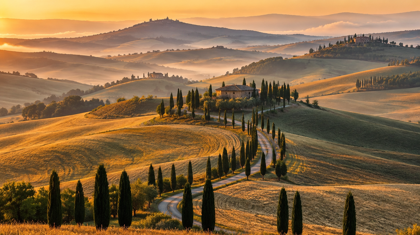
The single most useful habit I can hand you is to stop looking at a scene as one thing and start looking at it as three layers stacked on top of each other: something close, something in the middle distance, and something far away. Any one layer on its own photographs flat. All three together, each doing something slightly different, is what reads as dimension. In the rolling hills of Val d'Orcia, that middle layer is usually haze sitting between cypress-lined ridges. In the Dolomites, the same job gets done by the atmosphere between successive mountain ridges, and it is a more dramatic version of exactly the same trick.
The physics behind that trick has a name: aerial, or atmospheric, perspective. As distance from the lens increases, contrast drops, colors lose saturation, and tones shift toward a bluish grey, which is precisely why a distant ridge in the Dolomites looks pale and flat while the ridge in front of it reads sharp and saturated (Wikipedia, "Aerial perspective"). This is not a modern photography trick. Leonardo da Vinci refined the deliberate use of this effect in paintings like The Annunciation and the Mona Lisa, and the effect itself shows up far earlier than that, in Roman frescoes from around 30 BCE and in Chinese landscape painting long before Western art discovered it (Wikipedia, "Aerial perspective"). Standing on Passo Giau or Passo delle Erbe at sunrise, with four or five ridgelines receding into haze, you are looking at the exact same depth cue that a Renaissance painter was chasing five hundred years ago, except you get to capture it in a fraction of a second.
What matters practically is that depth requires differentiation between layers more than it requires physical distance. Landscape photographer Erez Marom made this point sharply in his composition series for DPReview: the brain reads depth from relationships between layers, not measured distance, so if elements are lit or colored differently, or carry different levels of fog or texture, the brain concludes they occupy different places, and that perception of depth can appear even in a scene that is objectively quite flat (DPReview, "Landscape Photography Composition – Part 6: Depth"). On a day when the Dolomites refuse to give you dramatic haze, look for any lighting or color difference between your layers instead.
Pro Tip: On a hazy Dolomites morning, do not wait for the haze to clear. Point a 70-200mm at a stack of three or four ridgelines receding into the mist and let the aerial perspective do the compositional work for you. The lens compression stacks the layers closer together in the frame, which makes the contrast and color fade between them even more obvious.
Foreground that earns its place
Foreground interest is the near layer, and it is also the layer most photographers get wrong by either skipping it entirely or dumping a random rock in front of the lens because someone told them to. A foreground element earns its place in a frame when it does three things: it is genuinely in focus, it relates to the rest of the scene instead of feeling randomly placed, and it functions as an entry point for the eye rather than becoming the whole photograph by itself.
There is a specific, well-tested version of this called the Rule of Odds: use an odd number of foreground objects, because the eye is naturally drawn to the middle one of an odd grouping, and treat those objects as stepping stones that guide the viewer's attention from the front of the frame back toward your main subject rather than as decoration (PetaPixel, "How to Use Foreground to Create Depth in Landscape Photos"). The same source flags the mistake I see most often in the field: a foreground object placed too close to the lens stops being a stepping stone and becomes the dominant subject, which usually was not the intent.
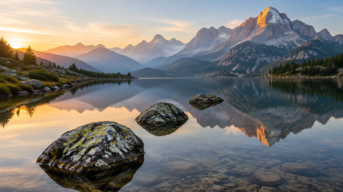
On the shoreline at Lago di Antorno or Lago di Misurina, this plays out almost exactly the way the theory predicts. Three lichen-covered rocks at the water's edge, spaced with a little separation between them, give the eye three steps to climb before it reaches the reflected cliff face behind them. One giant boulder shoved right up against a 16mm lens does the opposite: it eats the frame and the mountain behind it becomes an afterthought. I shoot this kind of scene at 16-24mm, low enough that the foreground rocks have real size without swallowing the shot, stopped down to f/11 with focus set roughly a third of the way into the scene.
Pro Tip: Before you commit to a foreground rock or shrub, ask whether it leads your eye somewhere or just sits there. If removing it would cost the photo nothing, it is decoration, not foreground interest, and you are better off moving a few steps until you find one that connects to the rest of the frame.
Leading lines that actually lead somewhere
Leading lines get summarized everywhere as "lines that draw the eye," which is true but incomplete. The National Park Service's own photography guidance puts it plainly: leading lines draw the viewer's eye to a subject in the image, using an example as simple as a road that guides focus toward a distant mountain (National Park Service, "Beginner's Photography Guide"). The word doing the real work there is "to." A line that wanders across your frame and exits without arriving anywhere is not a leading line, it is just a line. The most common mistake I see on a Dolomites ridge walk is a beautifully curving trail that leads the eye straight off the edge of the frame instead of toward the peak that should have been the actual subject.
Straight lines work, but converging and curved lines tend to outperform them for a specific reason: convergence mimics how parallel lines naturally appear to meet as they recede into the distance, which reinforces the sense of depth rather than just moving the eye sideways across a flat plane (DPReview, "Landscape Photography Composition – Part 6: Depth"). The Dolomites hand you this constantly in the form of switchback trails below Alpe di Siusi, scree fields that funnel toward a ridge, and the natural curve of a valley floor. Compare that to the cypress-lined roads of Val d'Orcia, where the leading line is man-made, a curving driveway compressed with a longer lens into one clean S-curve. Same mechanism, completely different terrain. In both cases the line only works because it ends at something, a farmhouse in Tuscany, a summit cross or a distinctive rock tower in the Dolomites, rather than dissolving into empty sky.
A quick field check before you press the shutter: trace the strongest line in your frame with your eye. If it runs off an edge, reframe until it either curves back into the scene or terminates at your subject. If it arrives at nothing in particular, either find a different line or wait until the light creates a destination, like a patch of alpenglow hitting one specific peak out of the five in front of you.
Visual weight and why some "unbalanced" photos work
Every element in a frame carries what the psychologist Rudolf Arnheim called visual weight, a kind of force that an object exerts on the composition because of contrast, and Arnheim argued that visual weight and direction are the two properties with the most influence on whether an image feels balanced (Wikipedia, "Visual weight"). A composition reads as fully balanced when the combined visual force of everything in the frame sits near the geometric center, and it starts to feel unbalanced as that force shifts toward the edges. Size, position, brightness, and contrast of both your foreground and your background elements all feed into where that force ends up (Wikipedia, "Visual weight").
This is the part most composition guides skip, and it is the actual mechanism behind every "you can break the rules" disclaimer tacked onto the end of a rule of thirds article. A tiny hiker silhouetted against a towering wall of rock at Tre Cime di Lavaredo is wildly "unbalanced" by grid logic, nowhere near a third-line intersection and taking up almost none of the frame, yet the photo works because the scale and contrast of the cliff face supplies enough visual weight to balance against that small, high-contrast figure. You are not breaking a rule there. You are using visual weight correctly while ignoring a grid that was never built to measure it.
When to break every rule
Centered and symmetrical compositions are the clearest example of a "broken rule" that actually works, and once you understand visual weight, it stops being a mystery why. A perfectly still reflection at Lago di Misurina at dawn, with the cliff face mirrored exactly down the center of the frame, creates its own balance: the top half and bottom half carry equal visual weight by definition, so centering the horizon does not unbalance the image, it is the only placement that keeps the symmetry intact. The same logic applies to a single dominant peak shot dead center with nothing else in the frame. Symmetry is not an exception to visual weight. It is visual weight arranged so precisely that any other placement would be the actual mistake.
The decision framework I use in the field is simple: before breaking a rule of thirds or leading-line convention, ask whether the scene already has its own source of balance, symmetry, a dominant subject, or extreme contrast, strong enough to carry the frame without the usual layering tricks. If yes, center it and let it breathe. If no, you are not looking at a deliberate exception, you are looking at a flat photo that needs foreground, layering, or a leading line to actually work.
| Technique | What it does | Where to use it on this itinerary |
|---|---|---|
| Foreground stepping stones | Gives the eye an entry point and a sense of scale | Lakeshore rocks at Lago di Antorno or Misurina |
| Near/mid/far layering | Builds the illusion of three dimensions in a flat frame | Ridgelines from Passo Giau or Passo delle Erbe at sunrise |
| Aerial perspective (haze) | Fades color and contrast with distance to separate ridges | Successive peaks beyond Tre Cime di Lavaredo in hazy light |
| Converging leading lines | Pulls the eye from foreground to a clear destination | Switchback trails and scree fields below Alpe di Siusi |
| Symmetry and reflection | Creates its own visual balance without a grid | Still water at Lago di Misurina at dawn |
Dolomites in practice: a worked example
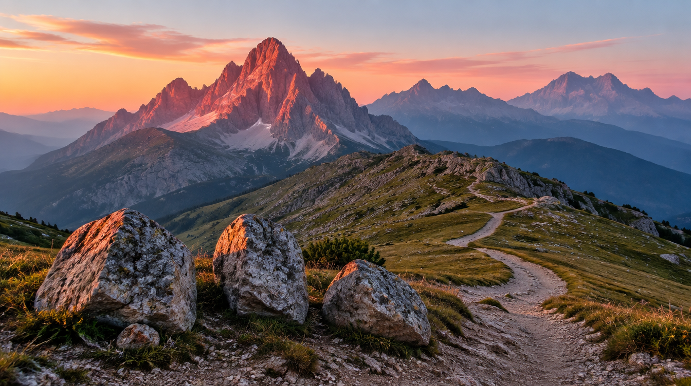
Here is how all four ideas stack together on an actual shoot. Picture a sunrise session at Passo Giau: the sky behind Nuvolau starts to pick up alpenglow, a warm pink light that only hits the rock for a few minutes before the sun clears the ridge and the light goes flat and white. I get into position well before that window, with a cluster of three weathered rocks at the edge of the pass as my foreground, spaced with visible gaps so the eye can step between them rather than reading them as one mass.
Behind that foreground, a dirt trail curves away from the rocks and climbs toward the saddle beneath the peak, a converging leading line that arrives exactly where I want the eye to land. Beyond the trail, three or four ridgelines recede into the pre-dawn haze, each slightly cooler and less saturated than the one in front of it, aerial perspective doing the layering work for free. I shoot this at 16mm to keep the foreground rocks large enough to anchor the frame, f/11 for a sweet spot between sharpness and diffraction, focus set a third of the way into the scene, bracketing three frames at zero, minus two, and plus two stops to protect the highlight the moment alpenglow hits the rock face.
The visual weight check happens last. Is the wall of Nuvolau dominating the right two-thirds of the image balanced by anything on the left? If not, I wait for a hiker or a patch of light on that side, or reframe wider until the rock face reads as balanced against the sky and the layered ridgelines beneath it. Foreground, layering, a leading line, then a final check for visual weight, in that order, every time.
Frequently asked questions about landscape composition
Is the rule of thirds still relevant, or is it outdated? It is still a useful starting grid, not a law. Even George Field, writing in 1845 shortly after the rule was first documented, cautioned that it was not universally applicable. Treat it as a default placement to deviate from once you understand what the scene's actual depth and visual weight need.
What makes a good foreground element in landscape photography? It needs to be in sharp focus, relevant to the rest of the scene, and positioned as a stepping stone the eye can move through rather than an object that dominates the frame on its own.
How close should a foreground object be to the camera? Close enough to add scale and a sense of near distance, but not so close that it becomes the dominant subject by accident. If a trailside rock starts reading as the main subject instead of an entry point, step back or choose a smaller element.
What's the difference between a leading line and just a line in the photo? A leading line has to arrive somewhere, a peak, a patch of light, a clear subject. A line that exits the frame or dead-ends at nothing in particular is just a line, not a compositional tool.
How do I create depth in a wide mountain panorama with no close foreground? Lean on differentiation between layers instead of physical distance. Different lighting, color, haze, or texture between ridgelines signals depth to the brain, even in a scene that is objectively flat.
What is visual weight, and why does it matter more than "the rules"? Visual weight is the pull an element exerts on a composition from its size, contrast, color, and position. It is the actual mechanism behind balance, and it explains why some compositions work without ever touching a grid line.
When should I break the rule of thirds or center my subject? When the scene already supplies its own balance, through symmetry, reflection, or one overwhelmingly dominant subject, centering is not an exception to the rules, it is the correct application of visual weight.
Do I need a wide-angle lens for strong foreground-to-background compositions? It helps. A 14-24mm range exaggerates the size difference between a close foreground and a distant background, which is useful for dramatic layered shots. For stacking distant ridgelines without a foreground, a 70-200mm compresses the scene and does the opposite job well.
Plan your own Dolomites composition trip
Reading about layering and leading lines only gets you so far. The terrain that makes these techniques click is the kind you need to stand in, watching alpenglow move across four ridgelines while someone who has shot that exact pass a hundred times tells you where to put your feet. That is the premise of our Dolomiti Photo Tour, an eight day trip through Alpe di Siusi, Passo Sella and Passo Gardena, Cortina and Passo Giau, Lago di Antorno and Lago di Misurina, Passo delle Erbe, and a finish at Tre Cime di Lavaredo. The pace is built around moderate fitness rather than technical mountaineering, with hikes up to about an hour to reach the viewpoints described in this guide, and the trip runs at $4,650 per person with a single supplement option, including seven nights of accommodation, ground transportation, breakfasts, airport transfers, guided coaching, and image review sessions. Upcoming departure dates are being finalized, so the fastest way to find the next one is to join the waiting list on the tour page.
Every location named in the worked example above, the rocks at Antorno, the trail below Giau, the stacked ridges past Tre Cime, is a stop on this itinerary. You get a guide to Dolomites composition and the chance to practice it in the exact spots where these photographs were made, with feedback the same evening instead of months later back home.
Sources
- Rule of thirds: Wikipedia entry on the technique's 1797 origin and historical use
- Visual weight: Wikipedia entry on Rudolf Arnheim's theory of compositional balance
- Aerial perspective: Wikipedia entry on atmospheric depth cues in art and photography
- National Park Service: Beginner's Photography Guide, on leading lines and the rule of thirds
- PetaPixel: How to Use Foreground to Create Depth in Landscape Photos
- DPReview: Landscape Photography Composition, Part 6: Depth, by Erez Marom