Editing Tuscany Photos: How to Bring Out Warmth Without Overdoing It
A practical Lightroom walkthrough for editing Val d'Orcia's golden hour warmth and summer haze without pushing into the oversaturated cliche look, with a full slider by slider before and after.
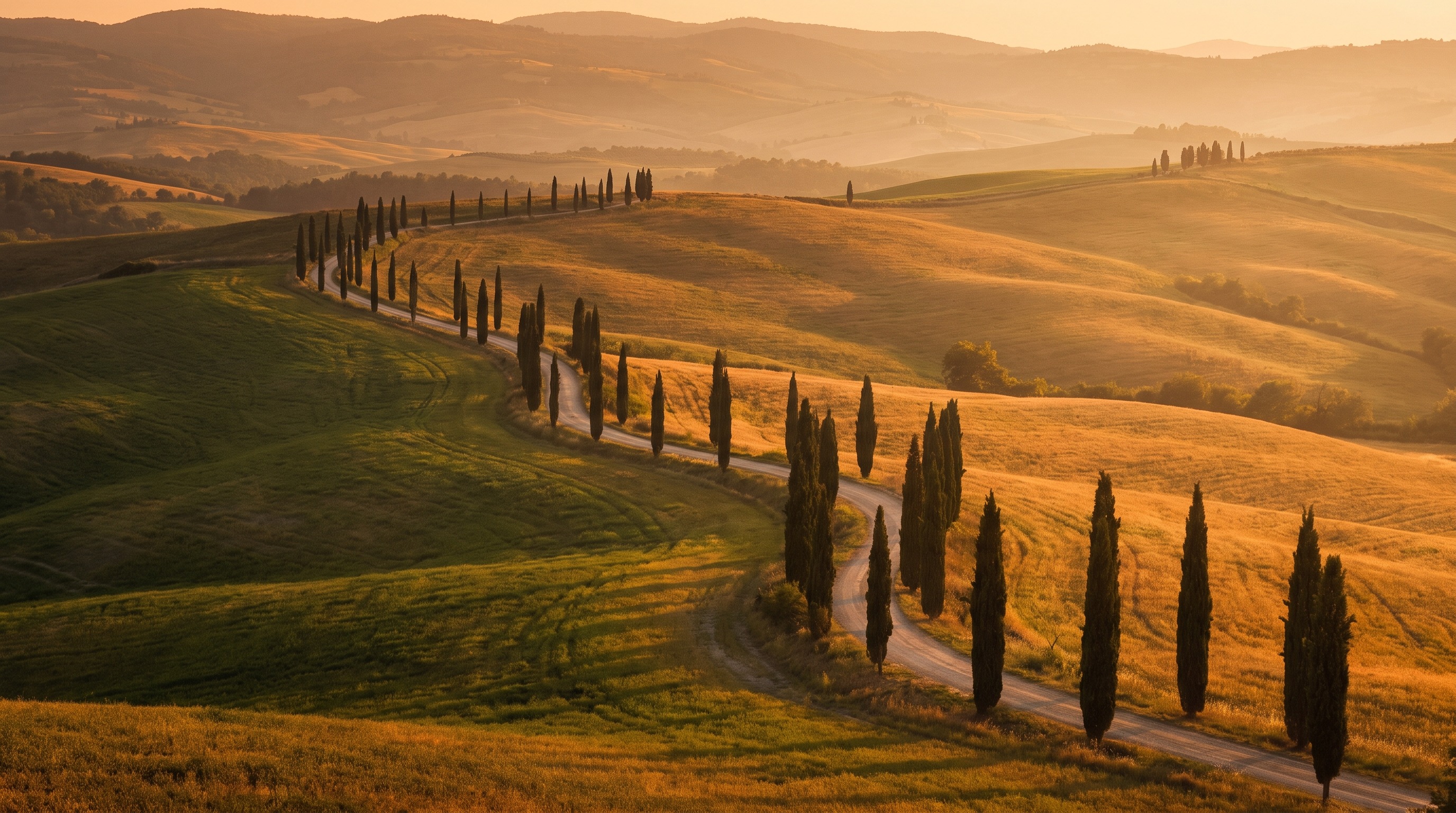
Editing Tuscany Photos: How to Bring Out Warmth Without Overdoing It
I used to be one of those photographers who dragged the Vibrance slider to plus 40 on every single Tuscany photo and called it done. The hills looked like a postcard, sure, but they also looked like a postcard from a place that does not actually exist. It took me a few trips back to Val d'Orcia, and a lot of side by side comparisons with what the light actually looked like standing there at sunrise, to figure out that the best Tuscany edits are the ones that feel warm without feeling fake.
This is a practical, Lightroom oriented walkthrough for editing the specific kind of light you bring home from Val d'Orcia and the surrounding hills. It covers the three problems that come up in almost every Tuscany raw file: golden hour files that want to turn orange everywhere instead of just where the light actually hits, summer haze that flattens contrast in a way global sliders cannot fix, and the general temptation to push saturation until the photo stops looking like a place and starts looking like a filter. None of this requires expensive plugins. It is mostly default Lightroom Classic tools used with more intention than most tutorials bother to explain.
Key Takeaways
Getting Tuscany's warmth right in the edit is less about pushing sliders harder and more about being selective with where the warmth goes.
| Point | Details |
|---|---|
| Start point | Set white balance by eye first, before touching any color or tone slider, using a neutral gray element in the scene if one exists |
| Haze fix | Use Dehaze sparingly (10 to 25) combined with a manual Clarity and Contrast boost, not Dehaze alone, which can crush midtones fast |
| Warmth control | Push warmth locally with radial and linear gradients on the light itself, not globally with the Temp slider |
| Saturation trap | Global Saturation almost always looks worse than raising Vibrance a little and adjusting individual hues in the HSL panel |
| Green hills | Pull the Green and Yellow luminance up slightly and saturation down slightly in HSL, rather than leaving them at default |
| Sanity check | Compare your edit to the actual RAW histogram and to your memory of the scene, not just to other Instagram photos of the same location |
Table of Contents
- Why Tuscany raw files are trickier than they look
- Start with white balance, not warmth
- Taming summer haze without losing mood
- Building golden hour warmth without painting everything orange
- Using the HSL panel to control the hills separately from the sky
- A short color grading pass for cohesion
- Local adjustments: where most of the actual warmth should live
- A full before and after, slider by slider
- Common mistakes that make a Tuscany photo look fake
- Frequently asked questions about editing Tuscany photos
Why Tuscany raw files are trickier than they look
Straight out of camera, a Val d'Orcia raw file almost never looks like the photo you remember taking. Part of that is normal, every raw file needs work, but Tuscany has two specific quirks that catch people out. The first is that the region's famous warm light is often paired with genuinely hazy air, especially from June through August, which means you are simultaneously trying to add warmth and punch back contrast that the atmosphere already stole from you. The second is that the hills themselves shift color dramatically by season, from bright spring green to golden dry summer to almost brown in late autumn, and a single "Tuscany preset" applied blindly will make a June field look like it belongs in October, or the other way around.
If you read our guide on shooting through summer haze, you already know that some of this fight happens in camera, with polarizers and shooting angle. But even a well exposed, well filtered raw file benefits from an edit that treats haze and warmth as two separate problems, because they are, and most one click presets treat them as the same slider.
Start with white balance, not warmth
Every Tuscany edit I do starts in the same place: the White Balance panel, before I touch Exposure, before I touch Contrast, before anything else. If there is anything close to neutral in the frame, a stone wall, a gravel road, the pale trunk of a cypress, I will click the white balance eyedropper on it first just to see what Lightroom thinks neutral looks like in that scene. Sometimes the auto reading is close and I nudge from there. Sometimes it is wildly off, especially in deep shade under trees where blue cast can be heavier than you expect, and the eyedropper click saves me from fighting a color cast for the rest of the edit without realizing it is there.
From that neutral starting point, I warm the Temp slider up gently, usually somewhere between plus 8 and plus 15 on the Lightroom scale, which is a small nudge, not a dramatic one. This is the base warmth for the whole image. All the more dramatic golden hour warmth comes later, locally, not here. Setting a slightly warm global base first and adding targeted warmth on top of it reads as natural light. Cranking the global Temp slider hard in one move is what makes a photo look like it was shot through an orange gel.
Pro Tip: Shoot a quick reference frame of your hand, a gray card, or a neutral gravel patch at the start of each session in similar light. It takes two seconds and gives you an anchor point if you get home and cannot remember whether a shadow area was actually blue or just looked that way on a small camera screen at 6am.
Taming summer haze without losing mood
Haze is the one problem almost every Tuscany photographer runs into eventually, whether it is the thick atmospheric haze of a July afternoon or the thinner, more romantic haze that often sits in the valleys at sunrise. The instinct is to slam the Dehaze slider to the right until the hills pop back into focus, and sometimes that is the right move, but pure Dehaze has a specific failure mode. It adds contrast unevenly across tonal ranges, which can crush your midtones and give skies an odd, slightly purple or magenta tint if you push past about 30 to 40.
My actual workflow is to use Dehaze more conservatively, usually in the 10 to 25 range, and pair it with a manual Contrast increase and a Clarity boost in the 10 to 20 range. Clarity specifically targets midtone contrast, which is exactly the kind of contrast atmospheric haze removes from a distant hillside, so a modest Clarity push does a lot of the work that people try to force Dehaze to do alone. If I want the layered look of distant hills separating from each other, the kind of depth we talk about in our guide to photographing rolling hills with real depth, I will sometimes add a graduated filter over just the far background layer and push Dehaze and Clarity slightly higher there than in the rest of the frame, since the haze is genuinely worse at distance than up close.
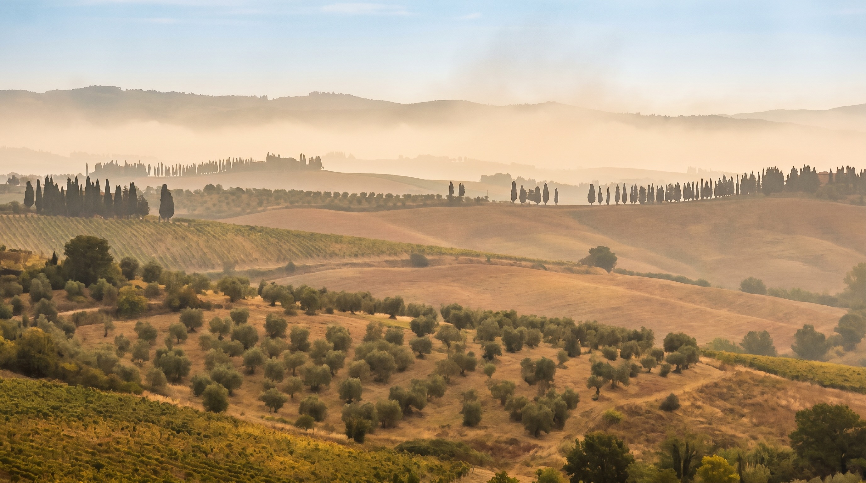
There is also a case for leaving some haze in on purpose. A thin morning haze over Val d'Orcia can read as atmosphere and softness rather than a flaw, especially in a photo built around a single strong foreground subject like a lone cypress tree. Before you reach for Dehaze automatically, ask whether the haze is actually hurting the specific photo in front of you or whether it is doing some of the mood building for free.
Building golden hour warmth without painting everything orange
Golden hour in Tuscany is genuinely warm, low, and directional, and one of the most common editing mistakes is trying to recreate that warmth by pushing the global Temp and Tint sliders until the whole frame matches the warmest part of the scene. The problem is that real golden hour light does not warm everything evenly. It hits the tops of hills, the edges of cypress trees, and any surface facing the sun with strong warm light, while shaded areas, valleys, and anything facing away from the sun stay comparatively cool and blue. A photo where every pixel is equally orange reads as an edit. A photo where only the sun facing surfaces glow reads as light.
In practice, this means most of my warmth work happens with local tools, not the global white balance panel. I will select the sky and any sunlit hillside with a graduated or radial filter and add warmth and a touch of extra exposure there specifically, while leaving shaded foreground elements closer to neutral or even nudging them slightly cooler for contrast. That temperature split between warm highlights and cooler shadows is most of what makes an edited photo look like it was shot in real directional light rather than corrected in post.
Using the HSL panel to control the hills separately from the sky
The HSL panel, short for Hue, Saturation, Luminance, is where most of the real color decisions in a Tuscany edit happen, and it is criminally underused by people who jump straight to the basic color sliders. The reason it matters so much here is that a typical Val d'Orcia frame contains at least three or four distinct color families that all need slightly different treatment: green or gold hills, blue or hazy sky, warm terracotta rooftops in villages, and often a deep, almost black green from cypress trees.
My starting adjustments, which I then tweak per image, look roughly like this. For the Green channel, I pull Luminance up 5 to 10 points to open up the hills a little, and pull Saturation down 5 to 15 points, because default green saturation in most camera profiles is more neon than what the eye actually sees standing on a Tuscan hillside. For Yellow, which covers a lot of the golden summer fields and warm stone, I usually nudge Saturation up slightly and Luminance down slightly, which deepens the gold without blowing it out. For Orange, which covers most terracotta roof tiles and warm skin tones if there are people in frame, I am conservative, small saturation moves only, because it is very easy to make roof tiles look like traffic cones if you get aggressive here. Blue gets a small saturation reduction if the sky looks artificially electric, which happens more than you would expect straight out of camera on a clear day.
Pro Tip: Toggle the HSL panel's target adjustment tool, the small circle icon in the top left of the panel, and click directly on the part of the image you want to change. It saves you from guessing which of eight color channels actually controls the hillside in front of you, and it is faster than eyeballing color names against a photo.
A short color grading pass for cohesion
After the HSL work, I do a light pass in the Color Grading panel, using the three wheels for shadows, midtones, and highlights. This is a subtle step and should stay subtle. For a classic warm Tuscany look, I add a very small amount of warm orange or yellow into the highlights wheel, matching the direction of the actual light in the photo, and a small amount of cool blue or teal into the shadows wheel. This split toning between warm highlights and cool shadows is a long standing color grading trick in film and cinema for a reason: it mimics how outdoor light actually behaves, with warm direct sun and cooler ambient sky light filling in the shadows.
I keep these moves small, usually under 10 on Adobe's saturation scale for each wheel. The color grading panel is meant to be a finishing touch that unifies an image that has already been corrected properly upstream, not a tool for fixing a flat or poorly exposed file. If you find yourself pushing the wheels hard to get warmth into a photo, that is usually a sign the exposure or white balance work earlier in the process needs another look.
Local adjustments: where most of the actual warmth should live
If there is one habit that separates a natural looking Tuscany edit from an obviously processed one, it is doing most of the warmth and contrast work with local adjustment tools rather than global sliders. My typical layer stack on a golden hour Val d'Orcia landscape looks something like this: a linear gradient over the sky to control exposure and add warmth to any clouds catching light, a radial filter centered on the brightest part of the hillside to boost warmth and a touch of Dehaze exactly where the sun is hitting, and a second, larger radial or brush adjustment over the foreground to keep it slightly cooler and less saturated so it does not compete with the lit hillside for attention.
This layered approach takes longer than dragging four global sliders, but it is the difference between a photo that looks like light and a photo that looks like a filter. It is also exactly the kind of workflow we walk through, frame by frame, on our own tours. If editing your Tuscany photos well matters as much to you as taking them, our Tuscany photography tours build in a guided evening editing session most days, where we sit down with the day's raw files and work through this same kind of local, light driven editing on real images from that morning's shoot, not stock photos in a generic tutorial.
A full before and after, slider by slider
To make this concrete, here is a representative slider progression for a golden hour shot of hills near San Quirico, shot at f/8, 1/125, ISO 100 on a wide angle lens, with a two stop soft graduated ND used in camera to hold the sky. This is not a copy paste recipe, since every file is different, but it shows the order of operations that tends to produce the most natural result.
| Step | Adjustment |
|---|---|
| 1. White balance | Eyedropper on a neutral gravel patch, then Temp nudged to plus 10 from that baseline |
| 2. Basic tone | Exposure plus 0.3, Highlights minus 40, Shadows plus 25, Whites plus 10, Blacks minus 10 |
| 3. Presence | Texture plus 10, Clarity plus 15, Dehaze plus 15, Vibrance plus 12, Saturation left at 0 |
| 4. HSL | Green Luminance plus 8, Green Saturation minus 10, Yellow Saturation plus 8, Blue Saturation minus 8 |
| 5. Color grading | Highlights warmed slightly toward orange, Shadows cooled slightly toward blue, both under 10 on the saturation scale |
| 6. Local: sky | Linear gradient, Exposure minus 0.4, Temp plus 8, to hold detail and add warmth to any cloud color |
| 7. Local: lit hillside | Radial filter, Exposure plus 0.3, Temp plus 12, Dehaze plus 10, feathered heavily |
| 8. Local: foreground | Brush or radial, Exposure minus 0.2, Saturation minus 5, to keep it from competing with the hillside |
Notice that global Saturation stays untouched the entire time. Every bit of extra color comes from Vibrance, which protects already saturated tones and skin tones from clipping, and from the targeted HSL and local adjustments. That is the single biggest technical difference between an edit that looks like warm Tuscan light and one that looks like a saturation slider dragged too far to the right.
Common mistakes that make a Tuscany photo look fake
The most common mistake, by far, is treating warmth as a single global slider problem instead of a lighting problem. Close behind it is over sharpening: Val d'Orcia's soft, hazy light does not need aggressive sharpening, and cranking the Sharpening slider past the defaults tends to introduce halos along the hill ridgelines that are obvious the moment you view the image at full size. A third common issue is orange skin tones from pushing global warmth too far when there are people in the frame, which is a dead giveaway on any tour or portrait style shot. Finally, watch your black point. Crushing Blacks too far in an attempt to add punch to a hazy midday shot can eat detail in cypress trees and shadowed valley areas that you will want back later, especially if you ever plan to make a large print.
Frequently asked questions about editing Tuscany photos
Should I use a Tuscany specific Lightroom preset? Presets are a fine starting point but almost never a finishing point. Apply one, then immediately adjust white balance and HSL to match the actual season and light in your specific file, since a preset built on a May green hill will not automatically work on an August gold one.
How much should I push Dehaze on a hazy Tuscany file? Start around 10 to 15 and pair it with a smaller Clarity and Contrast boost rather than relying on Dehaze alone. Past about 30 to 40, Dehaze tends to introduce color shifts in the sky that are hard to fully correct afterward.
Why do my Tuscany photos look orange instead of golden? This almost always means the warmth was added globally instead of locally. Try resetting the Temp slider closer to a neutral white balance and rebuilding the warm look with graduated and radial filters targeted at the parts of the scene actually lit by the sun.
Do I need Photoshop for this kind of edit, or is Lightroom enough? Lightroom Classic, or the Develop module in Lightroom CC, is enough for everything covered in this guide. Photoshop becomes useful for advanced compositing or removing distracting elements like a stray car or tour bus, but the color and tone work described here is entirely achievable in Lightroom's Develop module.
Should I edit differently for a black and white conversion? Yes, quite differently, since you are working with tonal contrast instead of color separation. We cover that specific workflow in our guide on black and white photography in Val d'Orcia.
Editing is the last step in a much longer process that starts with understanding when and where the light in Val d'Orcia actually does what you want it to do. If you have not already, our month by month guide to the best time to photograph Tuscany is a good companion to this one, since the season you shoot in determines a good portion of the editing decisions covered above.
