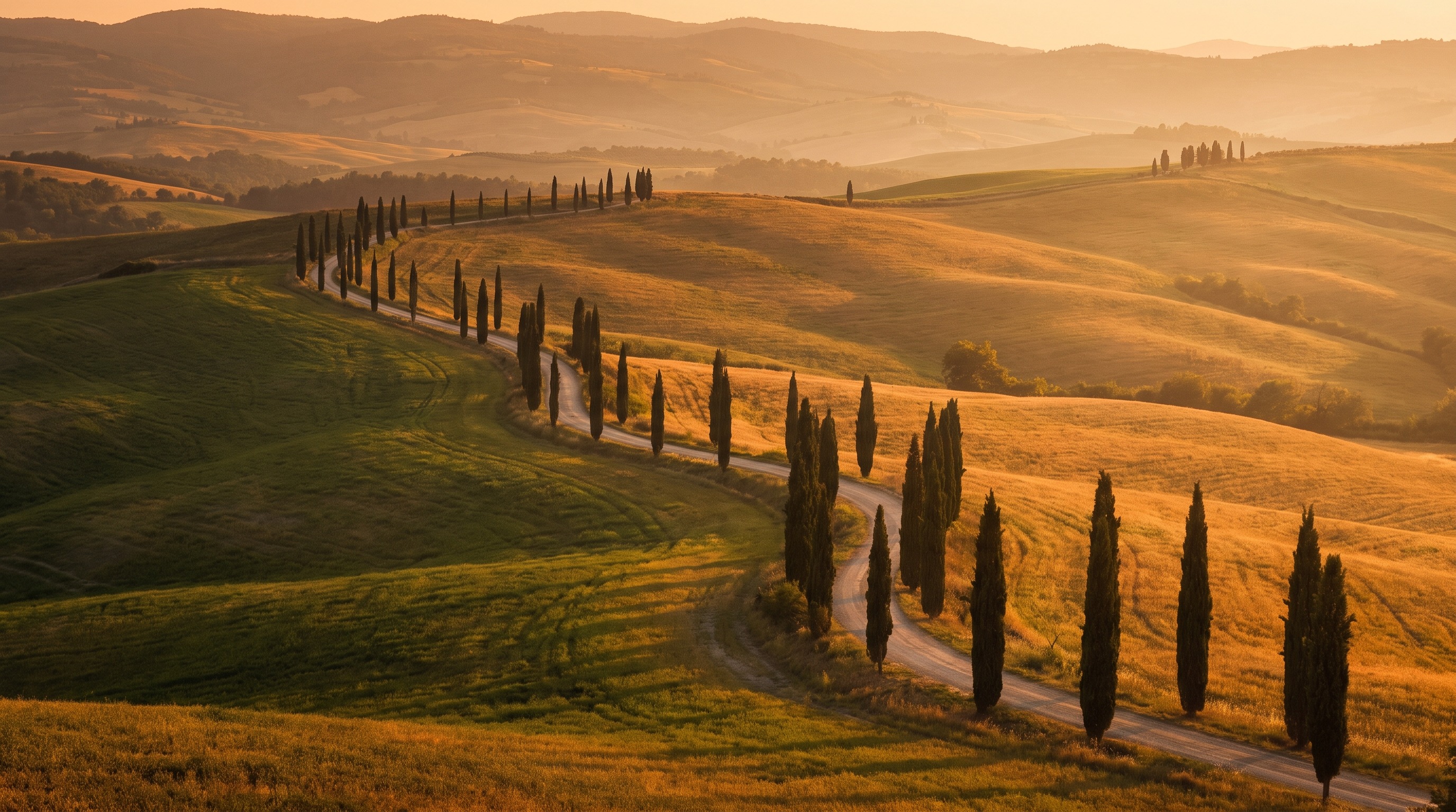
Black and White in Val d'Orcia: When Color Isn't the Point
Why some of the strongest images I have ever brought home from Val d'Orcia only became strong once I stripped the color out, plus a practical Lightroom conversion workflow for foggy and overcast conditions.

Black and White in Val d'Orcia: When Color Isn't the Point
I have a folder on my hard drive labeled "failed color shots" that I almost deleted about two years ago. It is full of images from flat, overcast mornings in Val d'Orcia where the light never did anything interesting, the sky stayed a dull grey the whole session, and the hills looked muddy instead of golden. I kept scrolling past them for months, half convinced the trip had just been a wash. Then one afternoon, mostly out of boredom, I dragged one of them into the black and white module in Lightroom and just sat there. The photo I had written off as boring in color turned out to be one of the strongest images from that whole week, once color was no longer the thing doing the work.
That folder taught me something I now build into every Val d'Orcia trip on purpose. Not every scene needs color to be great, and some scenes are actively better without it. This is not a claim that black and white is more "artistic" or more serious than color work, which is a tired idea I do not want to repeat here. It is a much more practical claim: certain lighting conditions and certain shapes in this particular landscape read as stronger photographs once you strip the color channel out of the equation. Flat fog, harsh graphic hillsides, and heavy overcast are the three conditions where I reach for monochrome almost automatically now, and I want to walk through why, plus the actual conversion process I use once I am back at the computer.
Key Takeaways
Black and white is not a fallback for a bad color photo. It is a deliberate choice for specific conditions where tone and shape carry more information than color does.
| Point | Details |
|---|---|
| Best conditions for B&W | Flat overcast light, dense fog, and midday sun on graphic cypress rows and hill contours |
| Worst conditions for B&W | Poppy fields, golden hour warmth, and anything where color itself is the subject |
| What actually matters | Tonal separation and shape contrast, not just a desaturated version of the color file |
| Field habit | Shoot in color and RAW always, decide black and white later at the computer, never lock it in-camera |
| Core Lightroom tool | The B&W Mix panel, adjusted by individual color channel rather than a single global slider |
Table of Contents
- The case for losing the color
- Three Val d'Orcia conditions where black and white wins
- What actually makes a strong monochrome landscape
- Shooting in the field with black and white in mind
- The Lightroom conversion workflow
- A note on grain and texture
- When to leave the color alone
- Bringing it together on a real trip
The case for losing the color
Color photography asks a viewer to process two things at once: the shape of the scene and the relationship between its colors. Most of the time that is a feature, not a problem. A poppy field at golden hour is a color photograph almost by definition, and stripping the red out of it would be a genuine loss. But some scenes are not actually about color at all. A hilltop town rising out of fog is about shape, silhouette, and the gradient of tone from dark foreground to pale background. A row of cypress trees against a flat grey sky is about rhythm and line. When you shoot those scenes in color, the color is not adding information, it is just sitting there, sometimes actively distracting from the shapes that are doing the real work.
Removing color forces a viewer's eye to do exactly one job, reading tone and shape, and that single job tends to land harder when the scene was built around tone and shape to begin with. This is not a new idea. It is the entire premise behind decades of landscape photography before color film was common, and it is why so many of the most enduring images of hill country and fog anywhere in the world, not just Tuscany, were made in monochrome. Val d'Orcia happens to be unusually well suited to this because its most iconic compositions, the lone farmhouse on a bare hill, the cypress avenue, the fog pooling below a hilltop town, are graphic by nature. They were graphic before anyone pointed a camera at them.
Three Val d'Orcia conditions where black and white wins
I do not convert everything. Most of what I shoot in Val d'Orcia stays in color, because most of what I shoot is lit well enough that color is part of the story. But there are three specific situations where I now expect, before I even lift the camera, that the image is probably going to end up in black and white.
The first is dense fog, the kind that pools in the valley floor below towns like Pienza and San Quirico on cool autumn mornings. Fog already desaturates a scene on its own, since it scatters light evenly and flattens contrast between distant and near elements. Fight that in color and you usually end up with a slightly washed out, slightly blueish image that looks like it is missing something. Lean into it in black and white and the same flattening becomes the entire point, a soft gradient from dark cypress silhouettes in the foreground to a nearly white valley beyond. If you have not chased the fog window here yet, our guide to photographing the fog in Val d'Orcia covers exactly when and where to be standing for mornings like this.
The second is flat, heavy overcast, the kind of sky that gives you zero drama and a soft grey light with no clear direction. In color, this light usually produces muddy greens and a flat, lifeless sky that competes for attention with the ground. In black and white, that same soft light becomes an advantage rather than a liability, because it removes harsh shadows and lets you see the full tonal range of the hills without any single bright highlight pulling focus. Some of my favorite Val d'Orcia frames were shot under skies I nearly packed the camera away for.
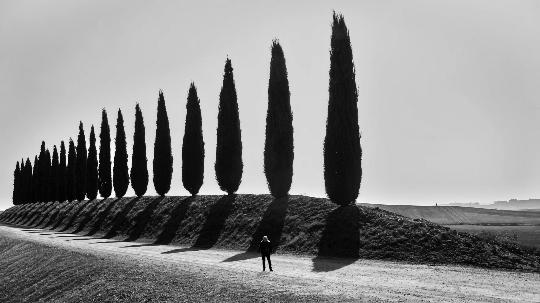
The third is harsh, high contrast midday sun hitting a graphic subject, most often a single cypress row or a farmhouse sitting alone on a bare hill. Midday light is the enemy of most color landscape work here because it flattens the warm tones and creates ugly, high contrast shadows. But that same high contrast, applied to a strongly graphic subject, can produce a genuinely striking black and white image, because the shadow and highlight separation becomes the composition instead of a flaw you are trying to work around. This is one of the only times of day I will still shoot on purpose, specifically because I already know the file is headed for monochrome.
Pro Tip: When you are unsure in the field whether a scene will work better in black and white, switch your camera's picture profile to monochrome for live view or the electronic viewfinder only, while still shooting RAW. Most mirrorless bodies let you preview a black and white rendering without throwing away the color data in the actual file, so you get to judge the composition the way it will eventually look without losing any editing flexibility later.
What actually makes a strong monochrome landscape
A common mistake, and one I made constantly in my first couple of years converting images, is treating black and white as a filter you apply at the end rather than a different way of seeing the scene entirely. Dragging the saturation slider to zero on a color photograph almost never produces a strong monochrome image, because a photo built around color contrast, like a red farmhouse against a green hill, loses its entire reason for existing once the color is gone. Both the farmhouse and the hill can end up as nearly identical shades of grey, and the image goes flat and lifeless.
What actually matters for a strong black and white landscape is tonal separation, meaning the different elements of the scene occupy clearly different points on the brightness scale from pure black to pure white. Think about the classic Val d'Orcia farmhouse shot: dark cypress trees, a mid-tone hillside, and a pale sky. Even with the color removed, those three elements stay distinct because they were already separated by brightness, not just hue. That is the scene you want to identify while you are standing there with the camera, before you have taken a single frame. Ask yourself whether the elements in front of you would still be readable as separate shapes if you closed one eye and squinted until the color disappeared. If the answer is yes, you are probably looking at a black and white photograph, whether you shoot it that way or not.
Shape and line matter almost as much as tone. Val d'Orcia's rolling hills create natural curved lines that repeat and layer into the distance, and a haze layer between ridgelines, even a faint one, does a lot of the work of separating those layers by value rather than color. This is the same layering principle we cover in our guide to photographing rolling hills with real depth, and it applies just as directly whether you are staying in color or converting later.
Shooting in the field with black and white in mind
Nothing changes about your camera settings in a technical sense. You are still shooting RAW, still metering for the highlights so you do not blow out a pale sky, and still using a tripod for anything at f/8 or narrower in low light. What changes is what you are watching for through the viewfinder. I stop paying attention to whether colors clash or complement each other and start paying attention purely to brightness relationships. A red farmhouse roof against green fields might look striking in color and completely flat once converted, if the red and green happen to sit at a similar brightness value, which is more common than people expect since the human eye is very good at perceiving color contrast and comparatively bad at judging brightness contrast on its own.
A circular polarizer is still worth carrying even when you know a shot is headed for monochrome. It does more than saturate color, it also cuts glare off foliage and stone, which increases local contrast and texture, both of which read strongly in black and white. I keep mine on for most fog and overcast shooting in Val d'Orcia regardless of whether I expect to convert the file, because the contrast benefit holds either way. For scenes with moving fog or drifting cloud layers, a light two or three stop graduated ND can also help hold detail in a pale sky without underexposing the foreground, giving you more tonal range to work with once you get to the black and white conversion.
Bracket your exposures on any high contrast midday scene you are planning to convert. A three-frame bracket at zero, minus two, and plus two exposure value gives you enough dynamic range to blend later if the contrast between a bright sky and a dark cypress row exceeds what a single RAW file can hold cleanly, which happens more often at midday than most photographers expect.
The Lightroom conversion workflow
Here is the actual process I use once I am back at a laptop, using Lightroom Classic, though the same logic applies in any editor with a channel-based black and white tool. This assumes a RAW file with normal exposure and white balance corrections already applied, following the general warmth and haze workflow from our guide to editing Tuscany photos, just stopped before the color grading step since none of that applies here.
First, convert using the dedicated Black & White treatment in the Basic panel, not a saturation slider drag. This unlocks the B&W Mix panel, which is the single most important tool in this entire workflow. Rather than one global desaturation, this panel lets you brighten or darken specific color ranges from the original file independently, even though the final image has no color in it. A pale blue sky can be darkened dramatically by pulling the blue slider down, producing the kind of dramatic contrast you would associate with a red filter on black and white film, without touching greens or oranges elsewhere in the frame.
| Scene condition | B&W Mix channel to adjust | Effect |
|---|---|---|
| Pale blue sky, want more drama | Blues, pulled down | Darkens sky, increases separation from clouds and foreground |
| Green hillside, want more texture | Greens and yellows, pulled down slightly | Deepens midtones, brings out grass and crop texture |
| Warm stone buildings, want them to pop | Oranges, pushed up | Brightens stone and terracotta relative to surrounding tones |
| Dense morning fog | Blues and aquas, small nudge only | Preserves the natural gradient, avoid overcorrecting a scene that is already low contrast |
| Cypress trees against sky | Greens, pulled down significantly | Deepens the trees toward near black for a strong silhouette |
After the mix panel, move to the tone curve and build a gentle S-curve, deepening the shadows slightly and lifting the highlights slightly, which increases perceived contrast without touching the midtones where most of a hillside's texture lives. I also push Clarity up more aggressively in black and white than I ever would in color work, often to plus 20 or 30, since local contrast reads as texture and detail once color is no longer available to carry visual interest. Texture and Dehaze both get a modest boost as well, particularly on foggy scenes where you want to hold some structure in the mist rather than let it go completely featureless.
Pro Tip: Do the B&W Mix adjustments before the tone curve, not after. Changing channel values shifts the overall brightness distribution of the image, and if you build your contrast curve first you will often need to redo it once the mix panel changes the underlying tonal balance.
A note on grain and texture
A small amount of film-style grain, added deliberately rather than left as noise, genuinely helps most black and white landscape conversions, particularly on smooth, low-detail areas like flat sky or heavy fog that can look slightly plasticky and digital without it. I add grain in the Effects panel at a low amount, usually 15 to 25, with the size kept relatively fine so it reads as texture rather than obvious digital noise. This is subtle enough that most viewers will not consciously notice it, but its absence is often what makes an otherwise well exposed black and white conversion feel flat and artificial rather than photographic.
If you plan on printing any of your Val d'Orcia black and white work, and I would genuinely encourage it, since monochrome landscape prints hold up beautifully on a wall in a way that busy color images sometimes do not, slightly higher grain and slightly higher local contrast than you would use for a screen-only image tends to translate better once ink hits paper.
When to leave the color alone
None of this is an argument for converting everything. The poppy fields around San Quirico and Pienza in late April and May are a color subject, full stop, and converting a strong poppy field image to black and white usually just throws away the one thing that made the photograph interesting in the first place. The same is true for golden hour warmth, which is one of the defining characteristics of Val d'Orcia light and the entire subject of our guide to editing Tuscany photos for warmth. If a scene's whole appeal is the deep orange and gold of the light hitting the hills at sunset, monochrome is working against you, not for you.
The general rule I use is to ask whether the photograph would lose information or gain clarity by removing color. Poppies losing their red lose information. A foggy hilltop town losing its slightly muddy, low-saturation color palette usually gains clarity, because that color was not adding much to begin with. Get comfortable making that judgment call scene by scene rather than deciding on a fixed rule like "always shoot fog in black and white," since even fog can occasionally carry beautiful, subtle color in the right light, particularly right at sunrise when the sun is just starting to hit the top layer of mist with warm light.
Bringing it together on a real trip
On a WeShoot Val d'Orcia photography tour, we build the schedule around exactly these kinds of shifting conditions rather than fighting them, which is part of why a guided trip tends to produce a more varied and more intentional portfolio than a solo trip with a fixed shot list. If the fog rolls in on a morning we had planned for a color-heavy composition, the guides on the ground know how to pivot the group toward the graphic, high contrast compositions that make that particular morning worth shooting in monochrome instead, rather than packing up and waiting for better light that might not come. If you want to see what a full day on one of these trips actually looks like, our Val d'Orcia photography tours page has the current itineraries, and it is worth a look if flexible, condition-aware shooting like this appeals to you.
Practically, my advice for anyone heading to Val d'Orcia with black and white on their mind is to not treat it as a separate shooting mode. Keep shooting in color and RAW the entire time, keep your regular workflow for exposure and composition, and just start training your eye to notice the specific conditions covered above, fog, flat overcast, and harsh graphic midday light. Make the black and white decision later, at the computer, when you can actually compare the color and monochrome versions side by side rather than committing in the field based on a hunch. Some of my strongest monochrome images started life as color files I almost deleted, and I would rather have the option and not use it than lose a genuinely good frame because I decided too early that it needed color to work.